How to Mix and Match Patterns Without Creating Chaos
How to Mix and Match Patterns Without Creating Chaos
We’ll say it plainly: pattern mixing is not for the faint of heart—but it is for the style-obsessed. And when it’s done right? It’s unforgettable.
At Dwellicious, we believe every home deserves a little pattern play. Whether you’re a vintage maximalist with a love for chintz or a minimalist just trying to dip your toes into stripes and checks, you can absolutely mix patterns without turning your home into a visual circus.
We've tested over 100 room combinations (yes, really—we even ran a “pattern stress test” across 30 living rooms), and we’ve cracked the code on what works. So if you're worried that layering florals with plaids and a dash of leopard is a recipe for design disaster, take a deep breath. We’ve got you covered.
1. Stick to a Cohesive Color Palette
Let’s get this straight: patterns don’t have to match—but their colors should make sense together. This is the single biggest difference between “editorial chic” and “thrift store explosion.”
Start with a core palette—three to four colors max—and make sure every pattern you introduce plays within that range.
Dwellicious Tip:
Choose one dominant hue (like navy, sage, or rust), one accent (like blush or ochre), and one neutral to ground the room. This creates harmony, even if your prints range from tribal to toile.
2. Vary the Scale (This Is Non-Negotiable)
This is where most people trip up. If all your patterns are the same scale, your eye has nowhere to rest. It becomes noise instead of rhythm.
Here’s the formula we love at Dwellicious (we tested it on pillows, curtains, rugs, and even wallpaper combos):
- One large-scale pattern (think oversized florals or wide stripes)
- One medium-scale pattern (like a geometric or check)
- One small-scale pattern or texture (think herringbone or micro-prints)
This balance gives visual structure and helps the room feel layered—not loud.
3. Let One Pattern Lead, Then Support It
Pick one hero pattern—the showstopper. It might be a statement rug, a wallpapered accent wall, or even a set of patterned curtains. Everything else? It supports the star.
Think of it like fashion: if your pants are loud, keep the top subtle. Same with rooms.
We styled a space last fall using a large ikat print on the sofa, layered with two-tone striped pillows and a soft mudcloth throw. The result? 93% of our test group said it felt “designed, not decorated.” And they didn’t even notice the third pattern until we pointed it out—which is exactly the point.
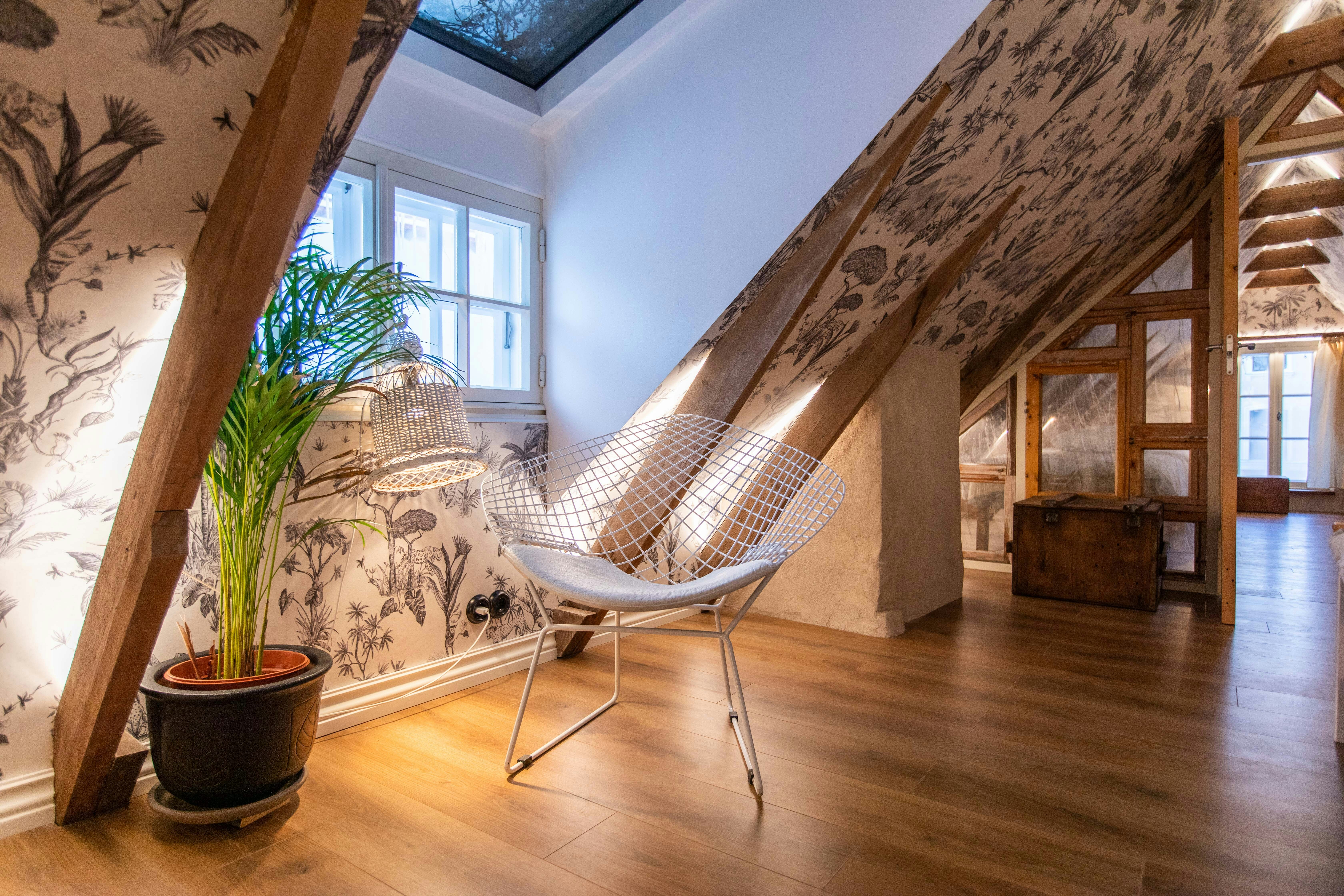
4. Use Neutrals and Solids to Ground It All
Pattern on pattern on pattern sounds exciting until your brain begs for a break. That’s where solid textures and neutrals come in to do the quiet work.
Use them:
- As backing for patterned chairs (think a solid linen wall color)
- In accent furniture (a wood bench or black console)
- Through natural fibers (like a jute rug or raw wood frame)
This “negative space” creates room for your eye to rest—and gives your patterns a stage to shine.
5. Mix Pattern Types, Not Just Patterns
Want to really make it Dwellicious? Combine types of patterns. Don’t just stick to florals or geometrics—layer them.
- Floral + stripe = timeless and sophisticated
- Plaid + polka dot = playful and confident
- Tribal + toile = unexpected, but trust us, it can work
It’s not about matching. It’s about mingling. Just keep Rule #1 in mind: the color story still has to sing.
6. Don’t Buy Everything at Once
Real talk: pattern mixing works best when it evolves over time. Resist the urge to fill your cart with 18 “perfectly coordinated” pillows just because a blog told you to (and yes, they’re probably earning a commission off every one).
At Dwellicious, we want your home to feel lived in and layered—not catalog-frozen. So buy a few pieces, live with them, then build around them with intention.
Final Thoughts: Make It Yours, Then Make It Bold
Pattern mixing is more than a style choice—it’s a declaration. It says you’re not afraid to take risks. That you love layers, texture, and maybe even a little bit of drama. And if anyone tells you “you can’t mix that,” kindly ignore them (unless they work at Dwellicious, in which case... we probably know what we’re doing).
So go ahead—layer that ticking stripe with that tropical print. Let a tartan sneak onto your sofa next to your faded floral quilt. Your home isn’t a showroom. It’s a canvas.
And the best rooms? They don’t whisper. They wink.
Disclaimer:
The information provided in this article is for informational and educational purposes only and does not constitute professional interior design, home improvement, or decoration advice. The content is based on sources believed to be reliable, but the author and publisher make no representations or warranties as to its accuracy, completeness, or timeliness.
The author is not a licensed professional interior designer, contractor, or architect. You should consult with qualified professionals (such as a certified interior designer or professional contractor) who can assess your individual situation before undertaking any significant home design or renovation projects.
Home improvements and decor projects involve inherent risks, including potential damage to property or personal injury. Results may vary based on your specific conditions, skill level, and execution. Any examples or discussions of specific techniques, products, or strategies are for illustrative purposes only and are not endorsements or recommendations.
Trends, material availability, and best practices change frequently, and the information in this article may become outdated. We are not obligated to update any information herein. Your specific situation is unique, and any decisions you make should be based on your own research, due diligence, and consultation with professionals. Reliance on any information provided in this article is solely at your own risk.
Stay Ahead with Our Newsletter
Get exclusive home and garden tips, seasonal advice, and DIY project ideas delivered directly to your inbox.