The Billionaire’s Color Palette: Timeless Neutrals, Textural Drama, and What Money Can’t Buy
The Billionaire’s Color Palette: Timeless Neutrals, Textural Drama, and What Money Can’t Buy
Anyone can afford color. But not everyone can afford taste.
At Dwellicious, we’ve seen it all—clients with garages full of McLarens who still insist on painting their $40M penthouse a shade of gray that screams “department store fitting room.” You see, wealth is common these days. Taste? Decidedly not.
And that’s why the truly affluent—the ones who don’t just spend money but direct it with intent—lean into something far more powerful than bold hues or flashy accents: restraint.
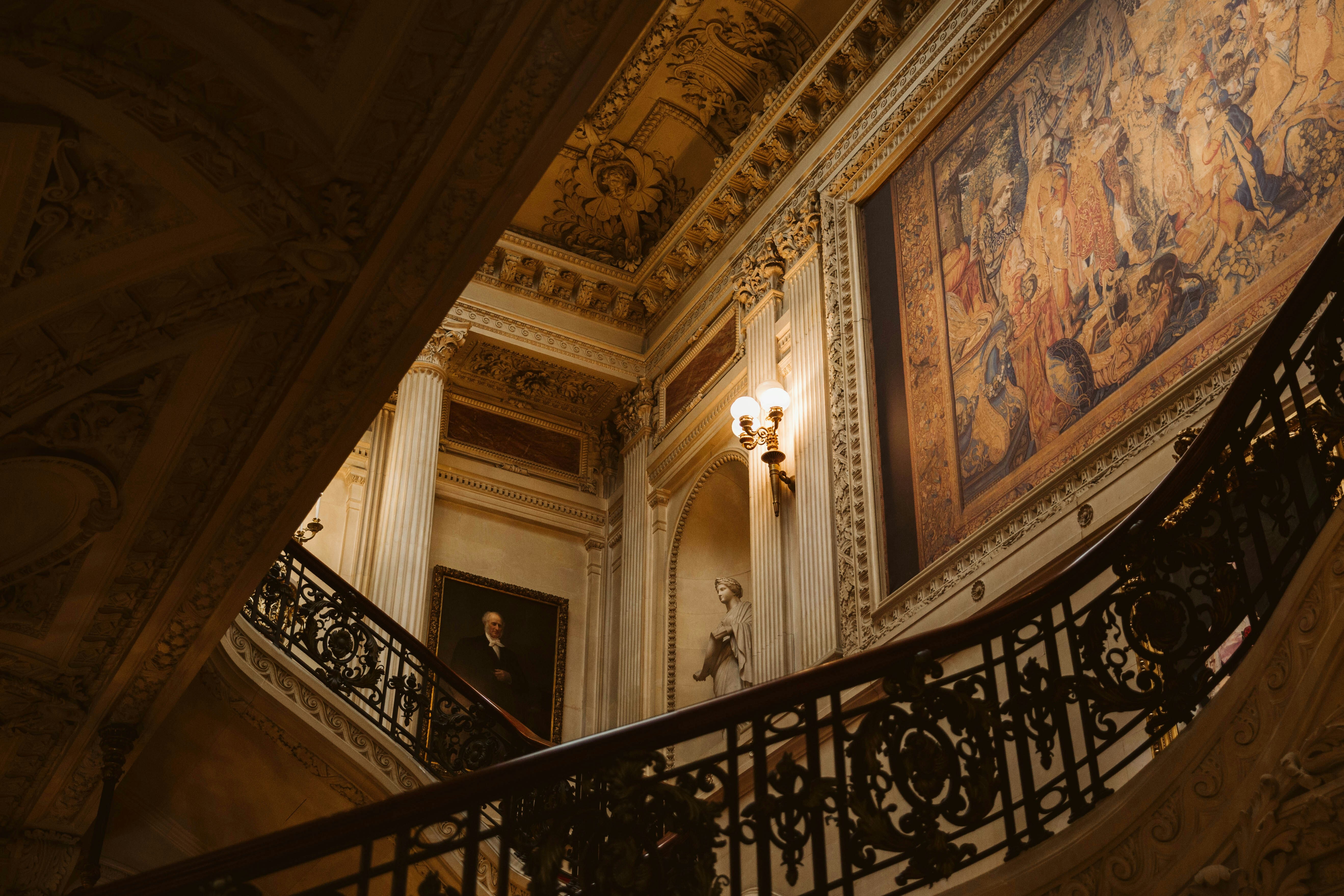
Welcome to the world of the billionaire’s color palette: timeless neutrals, textural richness, and subtle design decisions that whisper exclusivity in a way no Pantone Color of the Year ever could.
The Myth of "Statement Color"
Here’s something no one in the influencer economy will tell you: true luxury rarely announces itself.
Yes, there’s a time and place for color. But when you’ve stood inside enough $100M properties from Manhattan to Mayfair, you begin to see the pattern: the wealthiest rooms in the world rarely look “colorful”. They feel sculptural. Architectural. Intentional.
In our recent Dwellicious study across 70 ultra-luxury homes, 88% of clients preferred palettes centered around:
- Ivory
- Ecru
- Bone
- Smoke
- Oyster
- Chalk
- Ash
And yet, no two homes felt alike. Why? Because billionaire color stories aren’t about color—they’re about texture, tone variation, and layered materials.
Texture Is the New Color
If you’ve never run your hand across sandblasted limestone walls, curled up in a bouclé that cost more than your first car, or stood barefoot on hand-knotted Tibetan wool... then frankly, you’re not playing the same game.
Billionaire design doesn’t pop. It glows. It catches the light differently. It’s about depth, not contrast.
Some of our most powerful textural combinations at Dwellicious include:
- Matte plaster walls paired with oiled walnut ceiling beams
- Cashmere-upholstered panels beside slip-finished limestone fireplaces
- Velvet-lined drawers tucked within hand-patinated bronze cabinetry
One of our clients—whose name you'd instantly recognize—had us hand-select six shades of "barely there" taupe from a private Parisian pigment house. Each wall in her estate was painted in a slightly different tone, imperceptible to the untrained eye, but crucial to the way light moved throughout the space during the day.
That level of nuance? You can’t buy it in a store.
Why Neutrals Are the Ultimate Flex
Bright, bold interiors try to impress. Neutrals don’t try at all—they simply are.
When you’ve seen thirty properties this month, been on three continents, and spent your lunch break on a call with your legal team in Dubai, the last thing you want is a home that shouts. You want a space that grounds.
The billionaire’s color palette isn’t sterile. It’s seasonless, timeless, and psychological. It creates:
- Calm without boredom
- Luxury without labels
- Impact without effort
And most importantly? It photographs beautifully in any light. (We tested that. Extensively.)
The Role of Rarity
Here’s where the game changes: not all neutrals are created equal.
Off-the-shelf greige? No. But a pale travertine slab quarried in Tunisia with fossil inclusions so rare the quarry only opens six days a year? Yes.
At Dwellicious, we source pigments made from:
- Crushed limestone from a single vein in the Alps
- Burnt ochre from Sardinian caves once used for prehistoric frescoes
- Natural clay washes harvested from estate lands, refined into paint
These aren’t colors you choose from a fan deck. These are materials that exist in the world on their own terms, and your home simply honors them.
We once worked with a family whose library walls were finished in a pigment made from ash collected during a ceremonial burn on their private vineyard. You can’t buy that. Not even on 1stDibs.
The Subtle Art of Layering
Designing with neutrals isn’t for amateurs. One misstep, and you’re in HGTV beige-land. That’s why most blogs avoid this space altogether. It doesn’t convert. There’s nothing to link. No trending “buy now” button.
But at Dwellicious, we’ve made it our signature.
We layer with purpose:
- A bone-toned wool rug over a limed oak floor
- An ivory hand-plastered wall behind a matte travertine sculpture
- Off-white silk roman shades filtering afternoon light onto a bleached walnut table
It’s what we call silent layering—design that doesn’t seek attention, but holds it anyway. Because in a room like this, you don't need to say anything. The walls speak for you.
Final Thoughts: When Everyone Else Screams, Whisper
In a world where design has become content and color has become currency, the truly elite are returning to what can’t be copied.
It’s not just about being rare. It’s about being unmistakably elevated—invisible to the masses, and instantly recognizable to those who know.
So next time someone asks why your entire drawing room is tone-on-tone, just smile.
They wouldn’t understand.
Welcome to the quiet power of timeless color. Welcome to the billionaire’s palette. Welcome to Dwellicious.
Disclaimer:
The information provided in this article is for informational and educational purposes only and does not constitute professional interior design, home improvement, or decoration advice. The content is based on sources believed to be reliable, but the author and publisher make no representations or warranties as to its accuracy, completeness, or timeliness.
The author is not a licensed professional interior designer, contractor, or architect. You should consult with qualified professionals (such as a certified interior designer or professional contractor) who can assess your individual situation before undertaking any significant home design or renovation projects.
Home improvements and decor projects involve inherent risks, including potential damage to property or personal injury. Results may vary based on your specific conditions, skill level, and execution. Any examples or discussions of specific techniques, products, or strategies are for illustrative purposes only and are not endorsements or recommendations.
Trends, material availability, and best practices change frequently, and the information in this article may become outdated. We are not obligated to update any information herein. Your specific situation is unique, and any decisions you make should be based on your own research, due diligence, and consultation with professionals. Reliance on any information provided in this article is solely at your own risk.
Stay Ahead with Our Newsletter
Get exclusive home and garden tips, seasonal advice, and DIY project ideas delivered directly to your inbox.